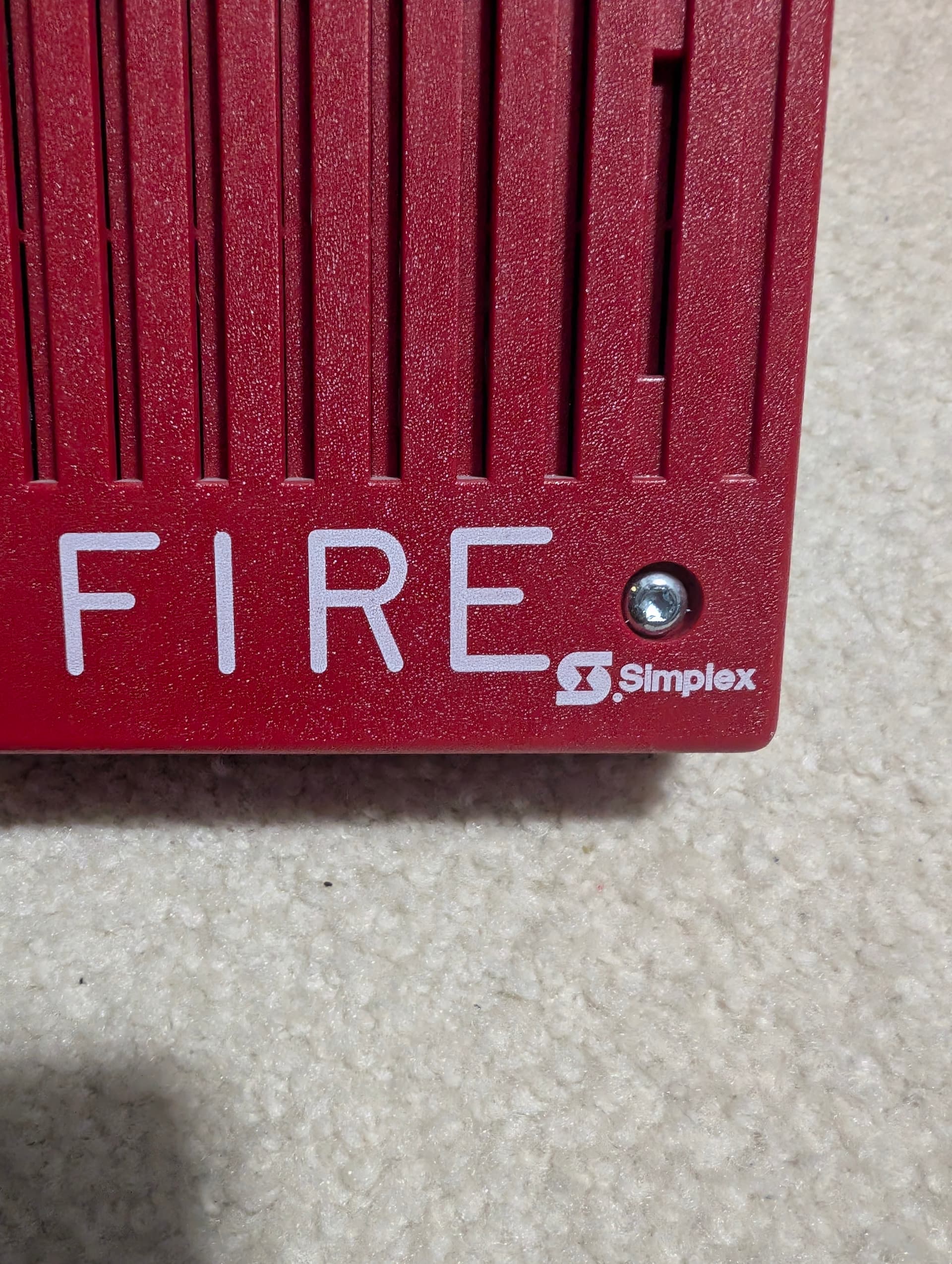
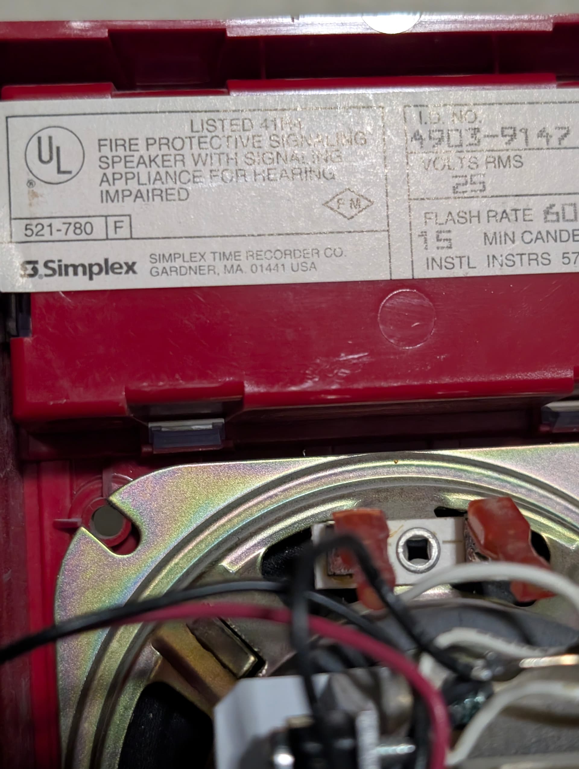
Does anyone know why some simplex devices have the old logo on the front but the newer logo on the label?
1 Like
I’m guessing that they had a whole bunch of some things made around the time of the switch so they just used them up. Also, they might have just decided to change some things first.
You know, I never actually noticed that: could have been like aerhardt said, where Simplex had a bunch of pre-printed shells & the like that they just decided to use so they wouldn’t sit around gathering dust (definitely resourceful & good-thinking on their part for sure).
Speaking of different logos, from what I gather Simplex made the switch to their “Frutiger logo” (the one they used up until around 2010 & probably the most well-known logo of theirs) around 1993, meaning devices with the logo like the one on the front of SpaceDust’s 4903 (the “Helvetica logo”) were likely made before then.
Can still be seen today. Plenty of stuff is still using the older version of the logo, like all of their stickers on boxes, for example, have not transitioned to the newer logo yet. Probably just a result of overstock or being slow to transition.
Oh, really? Huh, alright. Odd if you ask me since it should be relatively easy to use the new logo, & since it was replaced over two decades ago (during said time it was replaced again as well!).
Sorry, I forgot to clarify, the replacement for the 90s logo is still widely used. The logo with the new font is still slowly being phased in across all products. I don’t think any remaining product lines still use the 90s logo in new production.
Ah, okay, that makes more sense. Nice to see it still being used in some regard: it acts as a reminder of Simplex when they were better for sure (before they thought such things as changing a perfectly good logo were necessary among other things).
This reminds me of when Federal Signal first came out with the 2001-130, and they put the 2001-SRNB stickers on them until they got the 2001-130 stickers.
And, I don’t really see the difference between the 2 logos shown in the images. Kinda like I dont see the difference between the old and new Walmart logo (outside of the slight color shade change between the 2 walmart ones)
Really? Huh: definitely must make identification difficult sometimes.
One difference is that the 1976-1993 logo’s “Simplex” lettering is smaller than the “S” symbol to the left of it, while the 1993-2010 logo’s lettering is the same size as said symbol. Another difference is the typeface/font: the 1976-1993 logo uses Helvetica, while the 1993-2010 logo uses Frutiger (hard to see in some cases but trust me, there is a difference).
Funnily enough just like with Simplex’s logos there actually is a noticeable change in font with that logo as well!
They’re still easy to recognize due to the 130’s taller intake housing. The SRNB had a square one while the 130 had a rectangle one.