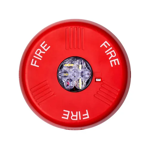
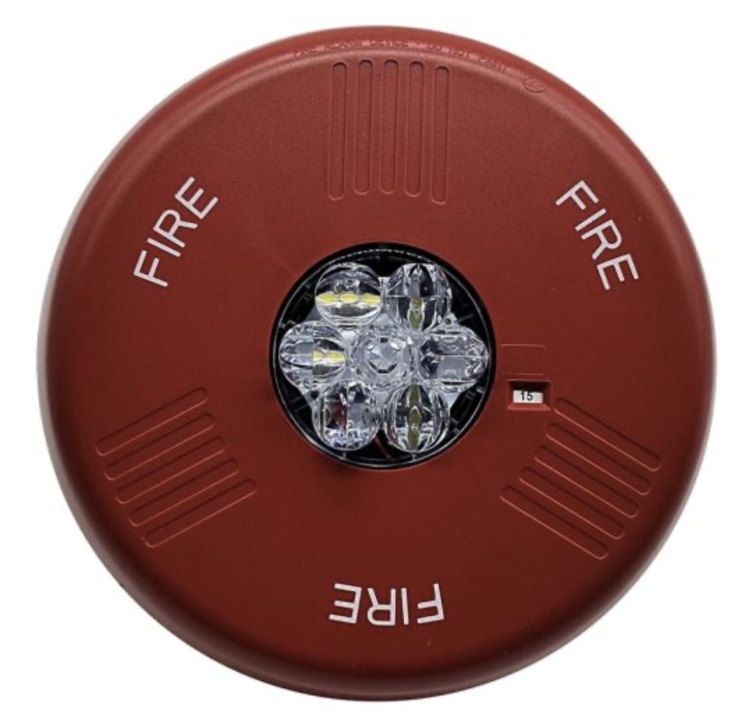
I noticed that Wheelock/Eaton apparently significantly reduced the size of the lettering on at least the Ceiling mount Eluxa devices recently. I think this change is bad, as I’ve seen the new versions in person at MSP airport, and they are significantly harder to read. I don’t see any reason for them doing this. As far as I can tell, this applies to all of the ceiling mounted devices. I’ve seen it on horn/strobes, speaker/strobes, and remote strobes in both red and white.
Any difference you see in the color is only from the different cameras. The color has not been changed to my knowledge.
What do you think of this change? I kind of like how it looks on the new ones, but that’s not the point. It makes it significantly harder to read, so I’d say it’s a downgrade.
Yeah that’s definitely not right, but what do you expect from Eaton? (Ruining Wheelock Since 2012™) Heck the lettering size probably should have been increased instead to better fill the areas around the horn grille patterns more since there’s plenty of space to do so, thus making the lettering even more visible, especially at a distance.
The speaker was definitely changed, since the 2-watt tap was changed to 5 watts on the first generation when using 70V input, and the modern Eluxa speaker has taps for 4 and 8 watts when using the 70V input. Also, I believe the terminals on the LED3 series were located on the device, but on the Eluxa series, they are located on the mounting plate, so the device needs to be thicker to have space for the mounting plate in the back.
Interestingly, I don’t see any photos online of ceiling speaker strobes with the smaller font size.
It’s definitely hard to tell, but after comparing pictures of old and new ones, I don’t think they changed anything about the plastic molding. That would have been about the only good reason to make the letters smaller.